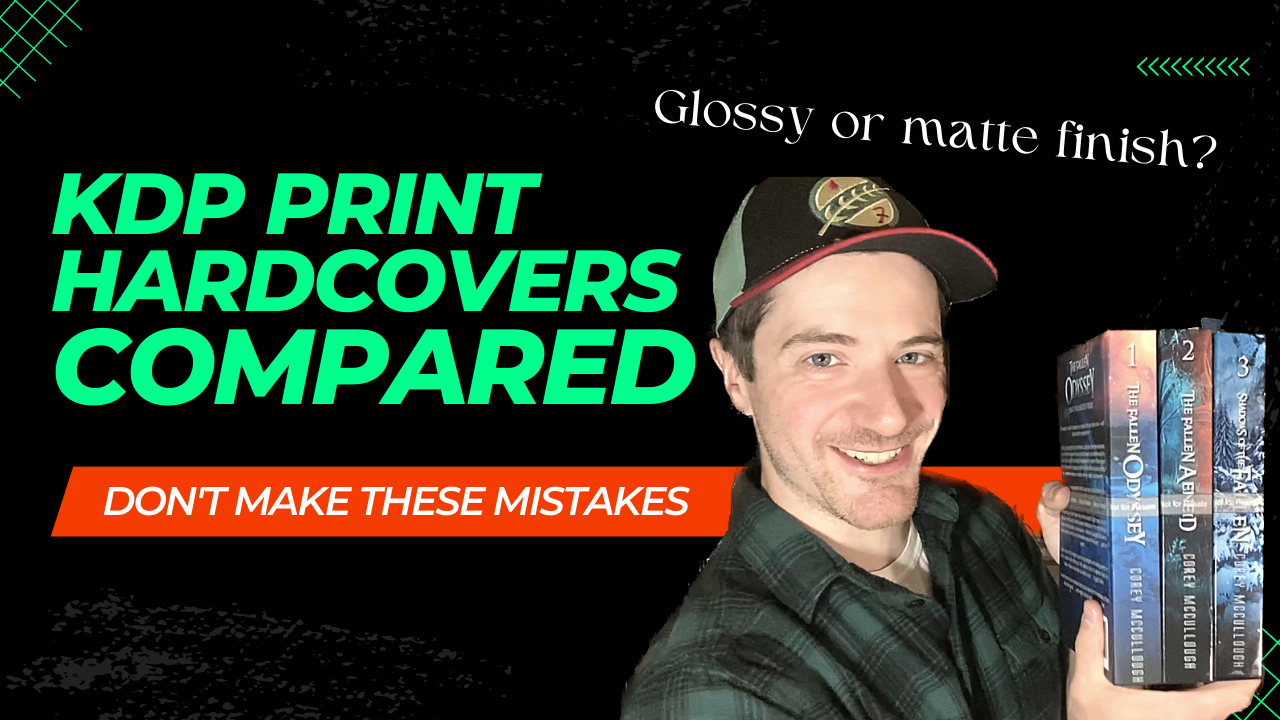
Paperback or hardcover? Glossy finish or matte finish? Today, I got some book mail that will hopefully help us answer those age-old questions. Plus, we’ll compare hardcover results from Amazon's KDP Print service.
As a ghostwriter, copy editor, book coach, and novelist, I've spent a heck of a lot of time on the Kindle Direct Publishing dashboard, often in the process of helping clients publish their own books, and also for my own paperbacks. For the most part, I've been happy with the results. But one thing I hadn't done up until now was experiment with the hardcover options available through Amazon KDP Print.
To celebrate the ten-year book birthday of the release of my first novel, I wanted to try bringing out some new editions of my fantasy series. This time, in hardcover.
This was a new one for me, so I had to order a couple rounds of proofs before I could really nail down the look I was going for. I decided to share the results here so you can see some of the different settings and how they turned out.
Glossy vs. Matte Finish in KDP Print
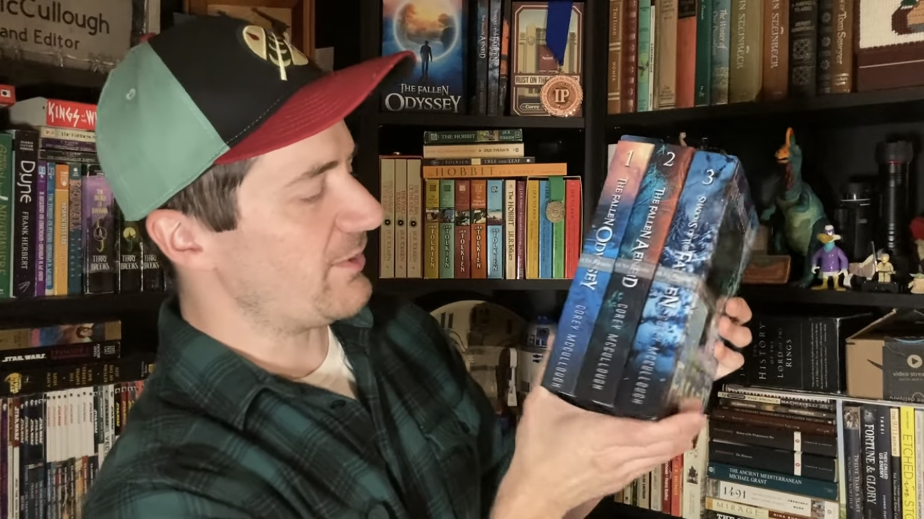
My first attempt at a hardcover edition was book one of my fantasy series, The Fallen Odyssey. Now, there are two different options for your cover whenever you use Kindle Direct Publishing. The first is a glossy finish, and the second is matte.
Glossy finish is just what you might expect. It's smooth and kind of shiny. But matte is more of a dull finish, with a rougher texture. In my experience, I’ve found that the matte finish looks a lot better on paperbacks than glossy, and it feels nicer too. When I ordered my first hardcover, however, I was in for a surprise.

I went with the matte finish but found that I really didn’t like the feel. And I felt like the cover image looked too dull. The colors didn’t seem as vibrant. Overall, it made the product seem less professional.
Cover Image Wrap Problems with KDP Print
The page count for these hardcovers was different than my paperback editions, so I obviously had to resize my wraparound cover image. Through trial and error, I’ve gotten pretty good at doing this. But an additional problem popped up that I wasn’t expecting, and it had to do not with the size of the cover image but the distribution of the elements in it.
For paperbacks, what you see on the screen is pretty much what you're going to get. The cover design you submit is going to go to the edge, and it's going to stop printing there.
Not so for hardcovers.

For a KDP Print hardcover, the cover image wraps around the interior ever so slightly. You might think this little overlap wouldn’t be enough to change anything. But that ever-so-slight deviation caused some problems with the spacing on my cover.
The title became really crammed on the front cover. And while it didn’t cut anything off, it just didn’t look very well put together. Not only that, but KDP Print users are instructed to leave a certain amount of space to account for variations. And if there's any variation between printers, well, the last thing you want is to have a letter of your book’s TITLE cut off.
With the back cover, I ended up running into the same sort of issue. The blurb text extended way too close to the edges and the bar code. But the worst case of this problem occurred on the book’s spine, where the author name almost got cut off at the bottom because of the way that the image wraps around see.
This KDP cover wrap problem is easily fixed, but it’s something you can’t identify on screen. You can look at a digital version all day and think you know how it's going to turn out, but you don’t know for certain until you're actually holding it in your hands.
That's why you order a printed proof!
Interior Revisions

When it came to the interior, I added some maps for the first time and was really curious about how they would look. I thought they turned out kind of cool, but the pages looked a little bland with nothing on the edges of the images. Plus, there was way too much space in the middle between the two sides of the map. I also thought it was a little difficult to read the labels, so I decided I needed to change that, too.
Side note: I made the maps on my own by teaching myself how to use a very cool mapmaking tool. And while, yes, a pro probably would have done a better job and it did take me a lot of time and effort, the fact that I know how to use it means that I can make any revisions I want, instead of going through a back-and-forth with a designer or artist.
Font and Paragraph Spacing
Now we come to the most important part of a book. The actual text.
Once it was in front of me, I thought the font was just a little too small, and I didn't like the spacing quite as much as I thought I would. This would not be an easy fix, however, because changing font size and paragraph spacing would of course have a knock-on effect that would alter EVERYTHING else down the line. Increased font/spacing means increased page count. Increased page count means a thicker spine. A thicker spine means a larger cover wraparound cover image. Which leads to having to redistribute all the design elements from scratch, hope it’s all centered, etc.
Ugh. The behind-the-scenes heartache we creatives go through for our work…
Ordering a Second Proof
Instead of ordering a new version of book 1 with all the fixes listed above, I decided to make the revisions and order a proof of book two of the series, The Fallen Aeneid.

For this one, you can see that the cover page overall turned out a lot better. I reduced the size of the title so it wasn't as crammed up against the edges, reducing the risk of it getting cut off. I think the spacing on the front turned out darn near perfect this time.
And what’s the difference between glossy and matte? Well, compared to the matte finish from my first proof, the glossy version turned out much nicer. To me, glossy finish on a hardcover just has a more of a professional look and feel to it.
When it came to the spacing of elements on the cover, I must have learned my lesson because the distribution of elements on the back cover and the spine turned out a lot better.
What's funny is when you look at the digital proof, it looks like there's WAY too big of a gap between the outside edges of the image and the text of the title. But once you hold it in your hands, you realize, nope! That space is exactly right.
On the back cover, I resized some of this text, and I used a different font so it would turn up a little bit better against that background.
As for the interior, I changed the font size and the spacing like I said I would, despite the headaches it would undoubtedly cause. I think it was worth the trouble because I liked this version of the spacing a lot better than the other version.
Interior Specifications
Font: EB Garamond 12, Size 11
Line spacing: 1.5
First line indent: 0.2"
Margins: Top 1", Bottom 0.75", Inside 0.75", Outside 0.75", Gutter 0.25"
Mirror Margins
And the big question: How about the maps?

Well, first off, I tweaked some of the image settings so my maps would appear a little bit sharper. It worked, but the labels still weren’t as crisp and clear as I’d like them to be. I added a frame around each map, which I felt gave it a more complete feel. And I got rid of the gap in the middle… but I think I got rid of it a little too much. Now, you have to really bend the page to see the middle of the map. For the next proof, I would have to find a happy medium.
Yes, there are currently three books in the series, so you can see where this is going.
My Third Hardcover Proof
Based on all the lessons I had learned so far, I made some adjustments and ordered a proof of book three, Shadows of the Fallen, to see how it all turned out.

The cover image turned out the best of any that I've done so far. The spacing is just right on the title. The author name is a little to the fold, but it looks pretty good.
The same could not be said about the spine and the back cover.

For some reason, the back is just way too spaced out this time. I'm not sure what I did differently, but again, this is why you always order a printed proof instead of relying on the digital image, because to me, when I looked at the digital proof of this, I thought it looked perfect. No problem, though. I’ll just have to adjust it a bit in my final revisions.

How did the inside turn out? Probably the best of any book I’ve ever done. I like how the spacing looks. I think the chapter titles and the interior art is just right.
For the maps, I adjusted the labels of the place names, making it much easier to read everything on the page.
With the adjustments, I'm really happy with how these maps turned out. It’s going to add a whole new dimension to reading this book when you can actually trace the journey that the characters make throughout the story.
Glossy and Matte Side-by-Side Comparison
I assumed I would like matte finish better for my hardcovers, just as I did for my paperbacks. But with a glossy finish, the colors look so much more vibrant. The contrast is higher. And, like I said, it just feels a lot nicer in your hand.
So, if you ask me, glossy finish is the way to go for KDP hardcovers.
The next step is to throw these proofs out, make changes based on all the lessons that I've learned, and then publish KDP Print hardcover editions of my books for the very first time.
If you've been thinking about using KDP Print, I hope this has helped you decide on some of the settings you might want to use. And, by the way, if you're running into any issues with your book or you have any questions about Kindle Direct Publishing, leave me a comment or get in touch! Between my books and the books I've done for clients, I've been through this process about a dozen times, so whatever question you have or problem you might be running into, chances are I've seen some version of it in the past.
If you liked this post, check out my novels! (I’m happy to say they are now available in paperback and hardcover!)
As an Amazon Associate, I earn from qualifying purchases on these product links.
The Fallen Odyssey: A Parallel Universe Fantasy Novel: https://amzn.to/3YdGSj4
The Fallen Aeneid: https://amzn.to/41ybBKE
Shadows of the Fallen: https://amzn.to/3L2Fhdh
A Knife in the Dark: https://amzn.to/41wOMqP
Rust on the Allegheny: https://amzn.to/3ZcvOnK